Get the free blank chart form
Show details
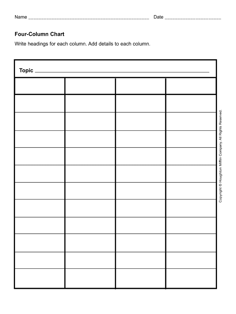
Name Date Four-Column Chart Write headings for each column. Add details to each column. Copyright Houghton Mifflin Company.
We are not affiliated with any brand or entity on this form
Get, Create, Make and Sign
Edit your blank chart form form online
Type text, complete fillable fields, insert images, highlight or blackout data for discretion, add comments, and more.

Add your legally-binding signature
Draw or type your signature, upload a signature image, or capture it with your digital camera.
Share your form instantly
Email, fax, or share your blank chart form form via URL. You can also download, print, or export forms to your preferred cloud storage service.
How to edit blank chart online


To use our professional PDF editor, follow these steps:
1
Log in to your account. Click on Start Free Trial and sign up a profile if you don't have one yet.
2
Upload a file. Select Add New on your Dashboard and upload a file from your device or import it from the cloud, online, or internal mail. Then click Edit.
3
Edit table chart template form. Add and change text, add new objects, move pages, add watermarks and page numbers, and more. Then click Done when you're done editing and go to the Documents tab to merge or split the file. If you want to lock or unlock the file, click the lock or unlock button.
4
Get your file. Select the name of your file in the docs list and choose your preferred exporting method. You can download it as a PDF, save it in another format, send it by email, or transfer it to the cloud.
With pdfFiller, it's always easy to work with documents.
How to fill out blank chart form

01
Start by identifying the purpose of the table chart template. Determine what information you want to organize and present in a clear and concise way.
02
Gather and organize all the necessary data that you want to include in the table chart. This may involve collecting information from various sources or conducting research to ensure accuracy.
03
Determine the categories or variables that you want to use as column headers in the table chart. These should be relevant to the information you are presenting and help in organizing the data effectively.
04
Assign specific rows in the table chart for each data point or entry. Make sure to maintain consistency and logical order throughout the table.
05
Fill in the table chart with the collected data, placing each entry in the respective row and column. Ensure accuracy and double-check for any errors or inconsistencies.
06
Consider adding formatting elements to enhance the visual appeal and usability of the table chart. This may include using bold or italic fonts, color-coding specific cells or columns, or utilizing different font sizes for emphasis.
07
Review and analyze the completed table chart to ensure it effectively presents the desired information. Make any necessary adjustments or additions to improve clarity and understanding.
Who needs table chart template?
01
Researchers or analysts who need to present data in an organized and visual format for easier interpretation and analysis.
02
Teachers or educators who want to create educational materials or lesson plans that involve presenting information in a structured manner.
03
Business professionals who need to track and analyze data, such as sales figures, financials, or project timelines.
04
Project managers who want to create a visual representation of tasks, deadlines, and responsibilities for effective project planning and tracking.
05
Students who are working on projects or assignments that require organizing and presenting data in a structured manner.
06
Individuals or organizations involved in data-driven decision-making processes that need clear and concise presentation of information.
07
Designers or artists who want to create visually appealing charts or infographics to showcase data or information in a creative and engaging way.
Video instructions and help with filling out and completing blank chart
Instructions and Help about printable table form
Hello in this screencast we'll take a detail look at clustered columns type of graph let's say you have this data set here widgets Inc and you have a bunch of data about sales of the various different regions and across different years and I also have done subtotals here by region and by year and let's say we want to start create a simple clustered column graph for this data first you select the data set insert a column I just choose a plain 2d column and that's your simple graph right there, but you can see that it's got some unnecessary data that probably does not belong in this graph for example it has totals by year, and it also has totals by region so how do we remove this data okay so let's first select this graph just make sure that it's highlighted when you do then you will see a design tab here with all this information now click on select data when you click this button you will see a pop-up box appear here and what you can do here is if you see a column here that doesn't belong for example totals by year you can just select it and click remove now then totals by year goes away, and you just have the north-south east and west represented in your graph, and you can see that your graph is slightly changed to reflect that supposing you want to remove totals by region what you can do is first switch row and column, and now you have totals by region as one of the rows, and you can just click remove to take that out, and now you just have the different years and if you want to can get back to your original configuration so that you have let's say each column be a year and within each column the height represents the total sales and within each year you have four different sub columns each for a different region and if you want you can interchange this so that you have instead of 2009-2010 you have not south-east and west appear here, so this will be not south-east and west and instead of the years appearing here you can have each of these columns be earlier to do that again select the graph make that active click on switch row and column so as soon as you do it your rows and columns are interchanged, so that's a quick and simple way to create a simple bar chart with clustered columns what if you wanted to have a slightly different style instead of clustered columns maybe you want to have all the columns stacked up one on top of another it's simple to do that just click on change chart type, and then you will be presented with all the different options, and you can just select a stacked column click OK and that will result in this kind of stacked column, and now you can actually see what's the total sales in each year, so you can see that or in this case in each zone you can see that East has the highest sales and within each sales within East Zone you have the sales broken up by the year, or you can switch rows and columns, and now you have the total sales by each year and for each column you have it broken down by sales by region, so that's...
Fill 4 column chart template : Try Risk Free
People Also Ask about blank chart
How do you format data as a table in Google Sheets?
How do you make a table chart?
How do you graph data from a table?
How do I make a table chart?
Where can I make tables online?
How do I make a table chart in Google Sheets?
Our user reviews speak for themselves
Read more or give pdfFiller a try to experience the benefits for yourself
For pdfFiller’s FAQs
Below is a list of the most common customer questions. If you can’t find an answer to your question, please don’t hesitate to reach out to us.
What is table chart template?
Table chart templates are pre-made documents that allow a user to create a visual representation of data in a table format. Table charts can be used to compare and contrast data points, or to illustrate the relationship between two or more variables. Tables can also be used to organize and display data from a variety of sources, such as surveys, polls, or financial reports.
Who is required to file table chart template?
Anyone who needs to organize their data in a visual format may find a table chart template useful. Examples of people or organizations who may need to use a table chart template include students, teachers, researchers, businesses, and other organizations.
How to fill out table chart template?
1. Start by deciding on the type of information you want to include in your table chart. This will help determine the format of your table.
2. Set up the table by adding column and row headings.
3. Enter the data into the table cells.
4. Make sure to check for any errors or inconsistencies in the data.
5. Add any additional formatting such as colors, borders, or text effects to make your table chart stand out.
6. Finally, save your table chart and print it out if needed.
What is the purpose of table chart template?
Table chart templates are used for organizing and presenting data in a visually appealing way. They are used to display data in a tabular format, allowing users to quickly scan and compare information. Table chart templates are also used for data analysis, as they can be used to identify trends and patterns in data sets.
What information must be reported on table chart template?
A table chart typically includes the following information:
• Headings: This is a description of the information being presented in the table.
• Rows: This is a list of the items that are being compared or organized in the table.
• Columns: This is a list of the categories or attributes that are being included in the table.
• Data: This is the numerical or descriptive information being presented in the table.
When is the deadline to file table chart template in 2023?
The deadline to file table chart templates in 2023 is April 15th.
What is the penalty for the late filing of table chart template?
The penalty for the late filing of a table chart template depends on the context. Generally, late filing of a table chart template may result in a fine, extra fees, or other penalties.
How can I manage my blank chart directly from Gmail?
pdfFiller’s add-on for Gmail enables you to create, edit, fill out and eSign your table chart template form and any other documents you receive right in your inbox. Visit Google Workspace Marketplace and install pdfFiller for Gmail. Get rid of time-consuming steps and manage your documents and eSignatures effortlessly.
Can I create an electronic signature for signing my blank table chart in Gmail?
You may quickly make your eSignature using pdfFiller and then eSign your blank table right from your mailbox using pdfFiller's Gmail add-on. Please keep in mind that in order to preserve your signatures and signed papers, you must first create an account.
How do I edit printable chart straight from my smartphone?
You can easily do so with pdfFiller's apps for iOS and Android devices, which can be found at the Apple Store and the Google Play Store, respectively. You can use them to fill out PDFs. We have a website where you can get the app, but you can also get it there. When you install the app, log in, and start editing blank table template form, you can start right away.
Fill out your blank chart form online with pdfFiller!
pdfFiller is an end-to-end solution for managing, creating, and editing documents and forms in the cloud. Save time and hassle by preparing your tax forms online.
Blank Table Chart is not the form you're looking for?Search for another form here.
Keywords relevant to table chart form
Related to chart template


If you believe that this page should be taken down, please follow our DMCA take down process
here
.
